Across Its Probes
article covered by InBroadcast
Why design matters
Good design has always had the power to change the way we live and work. From the first GUIs found in DNLS and Xerox’s PARC Alto, through to Microsoft’s eventual breakthrough into the mainstream with Windows 3.0 (third time’s the charm), there has been a recognition that what matters is not just what our technologies can do, but how they allow us to do it. We’ve seen the mouse, click wheels, touch screens… and BCI (Brain Control Interface) is – somewhat alarmingly – just around the corner.
But all of these mechanisms of interaction are just part of the equation. What matters as much as the physical mode of interaction is the underpinning logic of the layout. The challenge in mainstream design has always been how to allow a user to complete complex, multi-stage operations without an instruction manual. Achieving this requires careful observation and understanding of people’s instinctual and natural behaviour patterns: what they need, when they need it, and how the expect it to appear. When this understanding is properly harnessed, intuitive design doesn’t just make life easier, it makes technology more powerful, because it allows people to navigate complexity without being overwhelmed by it.
The engineer’s perspective
Of course, this principle applies as much in broadcast engineering as it does for the general consumer. In fact, in the control rooms of live sports, news, or event production, it’s even more critical. Engineers working in these environments need to process vast amounts of information under pressure. They can’t afford to sift through pages of menus or hunt for a single metric buried three screens deep. They need tools that provide clear oversight in the moment, with the option to dig down into the detail only when the situation demands. In other words, the interface has to work at the speed of live broadcast.
But that’s a serious challenge. Anyone who has ever stepped into a network operations centre during a live broadcast knows that it’s not a quiet place: banks of monitors, readouts, scopes, graphs, feeds. It’s a chaotic cacophony of data that represents a particular kind of Schrodinger’s cat: at once both noise and invaluable information, with the distinction between the two resting on how quickly a user can harness that information to spot an issue, understand its impact, and act.
This is why user interface isn’t just a cosmetic choice. It’s not about whether the screen looks good (though the value of a sleek aesthetic to sooth the eye should never be underestimated), it’s about whether it makes sense in the heat of the moment. Done well, it provides reassurance and efficiency; done poorly, it risks turning vital insight into irrelevant distraction.
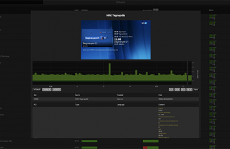
For decades, Bridge Technologies has recognised this. Their tools have always been built not only to deliver deep data but also to present it in a way that makes sense to the people who need it. The patented MediaWindow™, for example, was created to allow engineers to visualise network behaviour instantly at a glance. Later innovations such as StreamOverview and the VBC Live video presentation layer continued the theme: taking mountains of data and expressing them with elegance, clarity, and context.
A new era of usability
At IBC 2025, Bridge unveiled the next chapter in this story: a completely redesigned user interface across its family of distribution-focused probes.
The overhaul – met with a strongly positive response from visitors to the show – is significant. Years of incremental functionality had created a rich but complex environment within Bridge’s distribution-focused probes. Bridge recognised that the time had come to rethink how all of this capability was organised, prioritised, and surfaced. The result is a UI that feels more modern, streamlined, and dynamic: one that makes daily operation smoother and more efficient.

Key highlights:
- Vertical top-level navigation bar: Quick access to core monitoring data summaries, meaning less time searching for the essentials.
- Aggregated thumbnail, MediaWindow™, and microETR views: Faster scanning of multiple streams, helping operators get the big picture instantly.
- Dark and light mode: Adjustable to operator preference and room conditions, ensuring comfort during long shifts.
- Penalty Box stream sorting: Critical feeds can be flagged and prioritised, ensuring the most important problems rise to the surface.
- Faster, more responsive tables: Data updates feel immediate, reducing lag and boosting confidence in live decision-making.
- ETR290 configuration and status in-context: No more flipping between screens to get the full picture – everything needed for compliance checks is in one place.
Each of these changes may sound modest on its own, but together they transform the day-to-day experience of using Bridge probes. Engineers can move seamlessly between devices and focus their attention where it matters most, all while knowing they can dive deeper when necessary.
More than just a facelift
It’s tempting to think of UI updates as surface-level. But in the world of broadcast monitoring, they’re much more than that. They’re about building a working environment that supports accuracy, speed, and confidence. Bridge’s redesign reflects an understanding that visual clarity and usability are every bit as important as technical precision. The probes themselves – the VB330, VB220, VB120, NOMAD – remain as powerful as ever, delivering insight across IP, OTT, RF, satellite, and hybrid environments. But now, with the refreshed UI, they’re also faster, more intuitive, and more comfortable to use. It’s a reminder that in broadcast, as in consumer technology, good design isn’t a luxury – it’s the difference between stumbling in the dark and seeing everything clearly.